
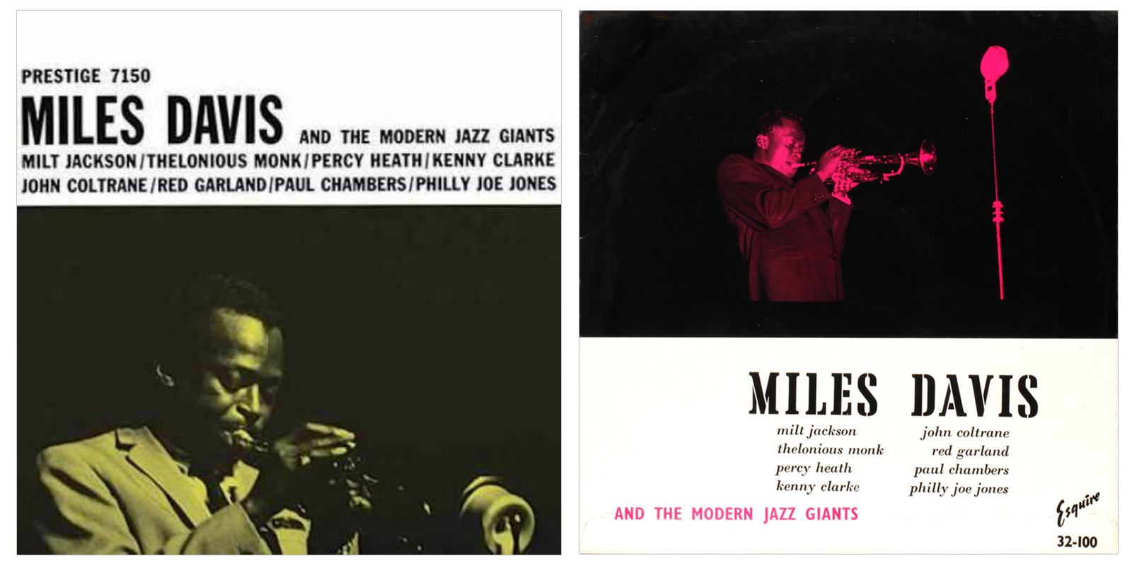
Prestige, as it has never seen before, through the alternative covers of the British Esquire label. Unlike previous collections of Esquire covers, this series is seen through the release schedule of the original Prestige titles, left, and the Esquire equivalent, right. Following the order of Prestige catalogue numbers, it tells the artistic evolution of Prestige as much as about Esquire. The early releases of the giants, Miles, Monk Mobley, Coltrane, McLean, Byrd and Rollins, through to the power-tenors and soul jazz in Esquire’s twighlight years, searching for a commercial formula that would stave off its final collapse, to no avail.
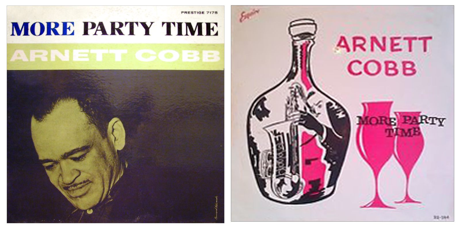
Uniquely among US overseas releases, Esquire Records were pressed in the UK with original US supplied stampers and not re-mastered locally, so are sonically the same as Prestige, in most cases showing van Gelder stamp and originating US matrix and plant codes. What differs are the alternative covers, a mixture of quirky native whimsy, kitsch graphics, alternative duotone colourings, and line-drawings based on the originals: sometimes you can see the original as inspiration, while others clearly start with different cultural reference points, the denizens of London’s smoke-filled Soho clubs and 52nd Street New York., two jazz-loving communities separated by only approximately the same language. Potayto, pottato. That is one of the things that make Esquire covers so intriguiging.
Why are covers of interest (umm, packaging, old-fashioned concept)? Well, what don’t downloads and The evil Silver Disk have? The cover is sort of the menu, that helps you decide if you want to eat here. It is the equivalent of the smell of the food arriving, before than the taste, it is part of the experience of consuming analog music. More interesting still they are a view through two different windows of the same thing.
This guide is fully on-line. You can scroll fairly quickly through a hundred or more album cover pairs, every pair enlarges to full screen, though the quality is variable where the best source is of poor photographic standard. The world’s ownership of cameras far exceeds the ability to use them effectively. Some of these records are very rare, and decent pictures of them rarer still.
Cover pictures are sourced from my own collection of seventy five Esquire titles, or the best I can find on the net, heavily retouched and resized 800×800 pixel to “art illustration” standard emphasising graphic design and not physical artefact. Defects rips tears, ringwear or blemishes, removed as best I can. Some of the most rare titles the picture quality is based on stretching a blurred thumbnail and not very satisfactory . If you have better, send me.
PART 1 – PRESTIGE / ESQUIRE


Prestige 7029, typo on cover states 7020


Esquire alternative cover


PART 2: NEW JAZZ/ ESQUIRE

It’s a pity some of these are not reissued on record with the Esquire Covers,some not all are better than the Prestige issues!
LikeLike
Very interesting survey. Thank you LJC!
I counted 20 Esquire covers which have identical covers to the original Prestige, or more or less identical, or heavily inspired. At the end of Esquire’s life they followed a policy of just copying the Prestige covers.
The twenty identicals are the Esquire equivalents of Prestige:
7032, 7038, 7080, 7094, 7103, 7127, 7143, 7157, 7170, 7186, 7187, 7193, 7206, 7209, 7210, 7223, 7225, 7232, 7232, 7236.
For Prestige 7005, 7039, 7064, the second US cover is shown.
Esquire 32-118 is a hybrid between Prestige 7025 and 7168.
The wonderful covers of 7105 and 7142 and the special 7123, all Coltrane albums, get very tasteless covers by Esquire. Trane deserves better.
LikeLike
The price of Esquires just went up
LikeLike
The one’s I already have get more valuable, but the ones I still want get more expensive, but it may encourage more sellers to cash in so supply goes up. Who Knows. It’s only money.
LikeLike
How weird to see that the official Rudy van Gelder remaster of “Sonny Rollins plus 4” on compact disc, in my case an American compact disc, sports the cover of the Esquire pressing. You’d think, as is usually the case with official reissues/remasters, that they’d used the original Prestige cover for that, but your list clearly says it isn’t so. Anyone in the audience who knows the answer to that question?
Oh, and thanks LCJ, for another superb overview 🙂
LikeLike
It may be of interest that both the OJC and RVG re-issues show “prestige hi fi l.p. 7038” in the right hand upper corner, making it look like an original Prestige cover. In fact, I didn’t even know there was any other cover than this one because I had never seen any vinyl version.
My research has shown that Prestige vinyl versions with the (purported?) Esquire cover do exist:
LikeLike
I think the Pink cover for Rollins +4 is the original!
LikeLike
If you look closely at this photo, you immediately understand why I am confused about this. Just click and look:
The Prestige of “Plus 4…” is clearly differs from the Esquire one. Eduard Linshalm refers to the Prestige pressing with the pink cover from an older post of LJC; question of course is: which one was first. And: would the Prestige pressing with the earlier, creamy white / black rectangles cover make it a pricier item…
LikeLike
I’ve just blundered into this one, I wasn’t trying to do an “exhaustive” on first Prestige but a reference point for Esquire. I have no special insight. I just plucked it off the bounty of the Internet, where everyone claims what they are selling is an “original” .
What ‘s needed is definitive line on alternative covers, then may be an encyclopedia of Prestige 1st pressings. It took DottorJazz around five years to complete his definitive Blue Note Guide. Prestige is actually less well documented than Blue Note, so more difficult!
Work in progress, there is more to be learned (and shared) A good start would be a list of those Prestige titles where more than one cover exists. I sense that is the next issue.
LikeLike
With my vast collection of orginal issues there is not much to wish for.Some years ago I was suddenly struck by the fenominal sound quality of the Esquire records.Because in my case “collecting” is an incurable disease,I started collecting them.The fact that most covers differ from the original ones is an extra “bonus”.Till now I found 22 12″s and 8 10″s,It is not easy to find them in a good condition and for a reasonable price. The main reason could be the fact that the label is very popular in Japan.In general they have an increasing interest in European labels and European pressings of US originals.Thanks for this nice overview of twin-covers.
LikeLike
Nice to see my favourite Esquire cover included (Rollins Plays For Bird). Wearing my jazz anorak: the cover pic on Standard Coltrane was taken by Val Wilmer at Flemings Hotel, Half Moon Street, London during November 1961. And how about the wonderful faux pas on the cover of Art Farmer an Donald Byrd’s Two Trumpets? A line drawing of none other than Clifford Brown!
LikeLike