
Return to: Columbia Records Overview
Skip to: Columbia Matrix Codes
THE LJC COLUMBIA LABEL CHEAT SHEET
Last Update: Dec 3, 2022
Updates: Two Eye label, black arrows 360 sound
Early Six Eye, Side information

1. Columbia: The Early Years pre-1956
1.1 Black Columbia “Magic Notes” logo
Down at the 6 o’clock position above the circled “LP” is the “Magic Notes” symbol, a black beamed semi-quaver reversed out on a white circle, which was the registered trademark of Columbia.

(Photo courtesy of Joe L)
1.2 Red Columbia /Gold print “Magic Notes” logo (1954)
(The Magic Notes symbol was licensed for use in the UK to EMI, hence the invention in the early ’60s of the CBS label to release Columbia recordings in Europe)
Promo (1955)

Photo courtesy of Jay C
Commercial release:

2. Columbia US (1955-61) Six Eye Label
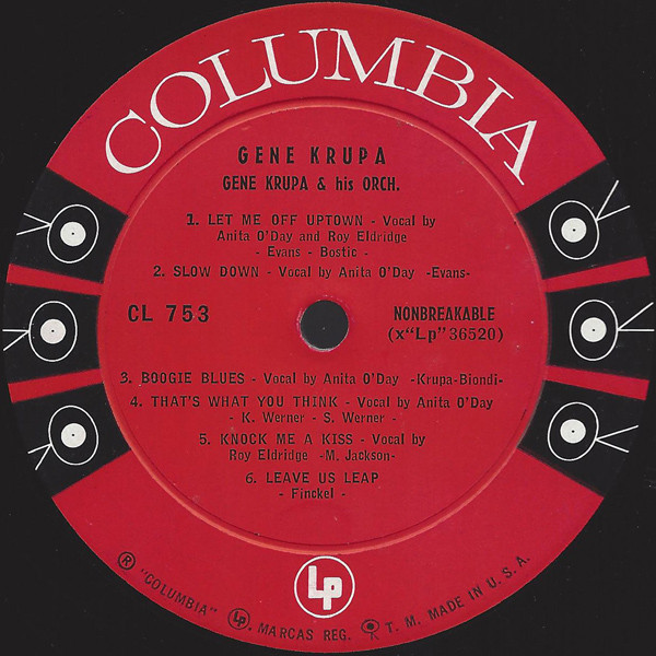
BSN Pubs: “Doris Day’s soundtrack album Love Me or Leave Me, released in early June 1955 on CL-710, may have chronologically been one of the first albums with the “six eye” label. Most albums released July 1955, or later have the new “six eye” label, but not all. Albums released as late as September 1955, have been found with the old label (the highest catalog number we have found is Columbia CL-664). “
Side / No Side Information
Early Six Eye label titles CL 701 – 753 follow an information convention in which the Side (1/2) is not identified on the label (the matrix number XLP ##### each side increments by one) Side information 1 or 2 is added to subsequent titles CL754 and higher, right of the spindle hole, and the text NONBREAKABLE moved to the left side, beneath the catalogue number. Repressings of popular titles can be found with both the early format, and the subsequent later format which includes the Side information. The no-side is identifiable as the earlier, original pressing.

2.1 Columbia six eye promo, mono and stereo, and Retailer
Retailer promo of forthcoming releases – record store ephemera c.1955


Promo Six Eye Labels
Promo labels for mono and stereo, below, circa 1959

(examples from Ebay, montage by LJC)
2.2 Columbia six-eye mono DG “walking eye” ™ (1956-61)
The Magic Notes logo gives way to the “Walking Eye” logo, a design which encompassed records TV and film in its ingenious ambiguity. The design commences with the “Six-Eye”, which is later reduced to two-eye, and finally one-eye, symbolising the more economical rate of eye-consumption in the manufacture of Columbia records. No, really.
2.3 Columbia Six-Eye Stereo DG (1958-61)

The Holy Grail, Kind of Blue, six eye stereo KoB
Columbia Canada variation (c.1958)
3. Columbia-CBS US (1961-67)
The Six-Eye Columbias were the stars of Fifties audiophile recording engineering and pressing, however, however around 1961 corporate changes at Columbia were signalled by the introduction of the “CBS” name in addition to “Columbia”. To judge from the few samples I have, the CBS Six-Eyes are inferior sonically to the original editions, in the case of my copy of Brubeck’s Time Out below, significantly so..
3.1 Columbia CBS overprint Six-Eye Mono US (1961)
Usually not DG, though there has been a sighting of CBS with Deep Groove.

Note the CBS overprint now appears, positioned at 12 o’clock. Not deep groove. The matrix confirms the cutting source as tape mix 1.The label says Six-Eye but the turnable says “hmmm…” May be just an end-of-run stamper artefact, but it sounds pretty poor – stodgy bass, blurred piano lacking transients, and Morello’s ringing cymbals all but disappeared. Many labelographies omit the CBS-overprint edition.
3.2 Columbia CBS overprint Six-Eye Stereo US (1961) no DG

(Photo courtesy of Joe L)
Note “CBS” added to the Stereo “arrows”, matrix number in brackets, smaller font and different kerning, notably the large Side number.
4. Columbia US Two-Eye (1962-70)
Changing times, the classic serif font is replaced and “modernised” by a gothic (sans-serif) font, the legendary Six Eyes reduced two. Two-Eye sound quality remains very much up there with the best, at least US pressings. Europe was saddled with CBS local production after they acquired the UK Oriole label and its “clapped out” plants. In most cases I have auditioned, Oriole pressings are markedly inferior to both the earlier Philips UK pressings and the US counterparts.
4.1 Columbia Two-Eye – Promo white label

Stamps in runout include what looks like it might be a letter “T” (Terre Haute?”) and a “horse-shoe” shaped small oval ring. Matrix codes on this title CL 2038 are all mix -2, as mix -1 was withdrawn due to a track sequence error/ conflicting with the printed centre label.
4.2 Columbia Two-Eye “Guaranteed High Fidelity” US (mono)
The first variety (1962-1963) featured the words “Guaranteed High Fidelity” at the bottom for mono LP’s

4.3 Columbia Two-Eye “360 SOUND” STEREO – black type

(Photo courtesy of Joe L)
4.4 Columbia 2-eye black font / black arrows

360 Sound stereo with black arrows. Initially the “360 SOUND” logo used black type, up until 1963, when it was replaced with white type.
WB Notes: The first two-eye design (on the later CL 1397 pressing, and also CS 8612), lasted from mid-1962 to about summer 1965. However, there were two variants of both “Guaranteed High Fidelity” (set here in Venus Medium, later replaced by mid-’63 with a smaller variant set in Copperplate Gothic Bold Condensed) and the “360 Sound” Stereo (first variant had no arrows, after mid-’63 the “360 Sound’s” were reduced in size and the arrows added on).
4.4 Columbia Two-Eye “360 SOUND” white type and arrows – MONO.

(Photo courtesy of Joe L)
The mono version from 1967 onwards is stripped of the white arrows and “360 SOUND” legend, with just the sole word “MONO” in its place.

WB Notes: The “360 Sound” Mono two-eye on the Brubeck “Time In” LP was almost wholly cribbed from the Columbia Masterworks two-eye LP design, except for the positioning of the 360 Sounds and the rim print at bottom. That variant was used from early 1966 to about spring 1967
UPDATE: WB Info 1967-70 variants July 27, 2020
The rim print: that’s a key indicator. The ‘NONBREAKABLE’ was struck from all LP label copy in or around February 1967, and there were three different label design variants between then and mid-1970. It was with the third that, around November-December 1967, the label printer shifted from using uncoated “Offset” paper (in which period the two-eyes seemed almost tomato red-ish) to “Gloss” coated stock (which saw the more magenta-ish red that appears to be PMS 199 restored to the label). Maybe I can help (with another album or albums):
LEFT: (though this label design variant had been in use since c.January 1966, for the purposes of judging copies without ‘NONBREAKABLE’ this design would have been in effect from February to March 1967)
CENTRE (label variant in effect from c.April to October 1967; 80(?) lb. Offset paper)
RIGHT: (post November-December 1967, label printed on 80 lb. Gloss paper, PMS 199 Red; copies pressed in Oct-Nov had this very design variant on uncoated stock with the tomato red)
You will see subtle differences in the spacing below especially.

4.5 Columbia Two-Eye “360 SOUND” white type and arrows, STEREO

Initially the 360 degree logo used black type. In 1963, the print on both mono and stereo copies was changed to white, and white arrows were added to the stereo logo.
The 360 degree sound was used for both mono and stereo editions up until 1967, when it was dropped from Mono, probably after someone asked the obvious question: how does Mono produce 360 degrees of sound?
WB notes: (CS 9632) first appeared (with uncoated paper stock in warm red ink) in fall 1967, and switched to glossy paper (with Pantone 199 Red) at the very end of the year. The ‘® “Columbia”,’ and ‘Marcas Reg. Printed in U.S.A.’ as well as the “360 Sound’s” on that variant were all cribbed from the Columbia Masterworks label design. The walking eye at the bottom was a new addition. Anyone who’s seen mono LP pressings from 1967-68 will note that the ‘® “Columbia”, … ” rim print at bottom is positioned slightly differently from on the stereo label.
5. Columbia-all-round – the modern label found on many later reissues

First editions and re-issues on the “Columbia all round” red label, date from the Seventies onward . This label had a life of probably twenty year or more, and there are some excellent pressings here, as well as some less than stellar transfers, depending on title and over the decades.
Pressing Columbia
Columbia at one time had five plants in operation, over time consolidated into three: Terre Haute, IN (1953 -1982), Pitman, NJ (1960 – 1986), and Santa Maria, CA (1963 – 1981). Bridgeport Conn and Hollywood Alden Drive plants transferred into their successor plants Pitman and Santa Maria. With ’60s and ’70s jazz LPs, two of the three are readily identifiable: by trail-off etchings – “T” and “COLUMBIA NY” – and distinctive font colour, orange – Indiana, and bright yellow – New York. There is no noticeable sonic difference between pressings from Columbia’s different plants (that I can detect). Columbia sent master cuttings for local manufacture to each of their plants, of which one, by definition, was the first cutting.

Though initially I had misgivings about the Columbia-all-round label, revisiting them after a number of turntable upgrades, they are generally very good and astonishing value.The stereo titles are a particularly nice addition to any collection.
Columbia vinyl last gasp – the fusion years and digital

How many Columbia engineers does it take to change a light bulb? This 1989 edition of Jean Luc Ponty’s Storytelling tells a story alright. Eight apparently, or nine if you include the eponymous Bernie Grundman. “More is better” motif (just don’t tell van Gelder) and in digital format “The Future!” ( just don’t tell the audiophile turntable manufacturers). A very ’90s view of the world.
The famed Columbia matrix number machine stamp and its legion of cuttings has disappeared, replaced by a handwritten matrix code, and the sleeve notes proudly declare this analogue vinyl record has been recorded, mixed and mastered “in the digital format”, an inglorious end to the Columbia legacy.
WB Notes: After the “Columbia Columbia” red/orange label was inaugurated c.June 1970, the two-eyes were consigned solely to deep-catalogue releases, with the last stereo labels used up by fall 1970 – and mono two-eyes continuing to be used well into the spring of 1972
6. Columbia Special Products

The Special Products service reissues classic recordings still on vinyl. Interesting to note the matrix indicates a second tape mix as source for the master, and the familiar excessive number of lacquer cuttings.
Postscript: COLUMBIA “MASTERWORKS”
Not strictly a jazz label, the classical “Masterworks” label seems to steer the same course: six-eye, two-eye, and finally Columbia-all-round. Examples below covering the period 1961 to 1972 .

Next: Columbia Labels UK & Europe
or go to: Columbia Matrix Codes
PRINTING COLUMBIA COVERS (Updated April 13, 2020)
At the bottom right corner of Columbia back covers is usually a number. According to the eponymous WB, these identify the following LP cover manufacturers:
‘2’ Imperial Paper Box Corp., Inc. of Brooklyn, NY
‘3’ Modern Album, Long Island, NY
‘4’ Imperial Packing Co., Inc., Indianapolis, IN
‘5’ Modern Album, Terre Haute, IN ‘6’ Imperial Packing Co., Inc., Indianapolis, IN, (when supply LA plants)
Examples of 2, 4 and 6 on 1959 promo copies of Kind of Blue.

Columbia’s Kind of Blue mono promo jacket codes 2, 4 and 6
Columbia owned pressing plants , with co-located metal parts and plating companies, at East, West and Central US locations. The manufacture of jackets seems to have been delegated to specialist local print and packaging companies. There has to be one or two cover manufacturers located around LA/Hollywood. Beatles fanatic have come up with this map
“The following factories used the following identification numbers in the mid-60s ”
| Cover fabricator | Number | Send | Press Plant |
| Imperial Paper Box Corporation, Inc., Brooklyn, New York | 2 | –> | Scranton factory |
| Modern Album, Long Island, New York | 3 | –> | |
| Imperial Packing Co., Inc., Indianapolis, Indiana | 4 | –> | Jacksonville plant |
| 6 | –> | Los Angeles
L.A plant |
|
| Modern Album, Terre Haute, Indiana | 5 | –> | |
| 9 | –> | Jacksonville plant |
This suggests the “6” is one of two codes of Imperial Packing Indianapolis, used when suppling covers to the Capitol plant in LA.
“W.B.” …… Writes.
“As far as the numbers are concerned, they corresponded to the respective factories from which the covers were produced. Per the Spizer book, on mid-’60’s rainbow label Beatles LP’s #2 indicated Imperial Paper Box Corp., Inc. of Brooklyn, NY, #3 indicated Modern Album of Long Island, NY, #5 was Modern Album of Terre Haute, IN and #6 was Imperial Packing Co., Inc. of Indianapolis, IN. This latter firm may have also been #4 (as on Jacksonville, IL pressings), and later-’60’s Jacksonville pressings also had a #9 which may have come from Modern (IN). Apparently, #2 and #3 were associated with Scranton pressings, with #5 and #6 associated with L.A. pressings. But the numbers themselves were related more to the jacket fabricators.
For many years after that point, Columbia-pressed copies of LP covers with black-and-white print on the back had the following symbols on the lower right-hand side thereof: a heart shape (either black or light grey) for Pitman, N.J.; an “A” designation for Terre Haute, Ind.; and an “S” (either as a letter or as a distorted bold symbol) for Santa Maria, Calif.”
Runout stamps
Columbia Records Pressing Plant, Terre Haute = letter “T” etched or stamped into the run-outs. Many times it will be a “T 1”, “T 2”, etc. or written in the reverse, “1 T”, “2 T”, etc.
This is from the Perry Cox guide (cited on Discogs) a Beatlefan adds applicable dates
None Scranton Up to 1966 2 Imperial Paper Box Corp., Inc. of Brooklyn, NY . Scranton Up to 1967 ,
3 Modern Album of Long Island, NY > Scranton Up to 1969,
4 Imperial Packing Co., Inc. of Indianapolis, IN > Jacksonville, IL 1965-1968,
5 Modern Album of Terre Haute, IN > Los Angeles 1964-1966,
6 Imperial Packing Co., Inc. of Indianapolis, IN LA or Winchester 1964-1971,
7 Columbia 1969 (original or subsidiary label)
8 Decca? c. 1966
9 Modern Album of Terre Haute, IN Jacksonville, IL 1968, 1970-1974,
COLUMBIA PRESSING PLANTS
Complex national operation of up to five plants at any one time, finally reducing down to three:

PLUS:
Columbia Bridgeport Conn. 1473 Barnum Avenue, Bridgeport, CT 06610 Founded in 1934 active until 1964.

WB: It was in late March, 1964, that Columbia shut down its Bridgeport plant, transferring all East Coast pressing activities to their newer Pitman, NJ plant that first went into operation in May 1961, closed in March 1981;
The label typesetting associated with Bridgeport would also go to Pitman, though on Columbia, Epic and subsidiary releases, the Linotype fonts would not really reappear on a regular basis until summer 1965. The Pitman plant ceased manufacturing vinyl in 1986-87
Bridgeport and later Pitman used paper labels with Artist, Title and Track names set in Linotype Erbar LT Bold Condensed – shown below is a 1959 KoB promo (with Erbar Light Condensed for comparison). This font set distinguishes Bridgeport/Pitman pressings from those at other Columbia Plants, where other fonts were in use.

WB: “Many have erroneously cited the code “CT” as signifying the Bridgeport plant when, in fact, it was a code for Columbia’s Terre Haute, IN plant (as was ‘CTH’). Back when Columbia was pressing records in Bridgeport, the common abbreviation for the state was ‘Conn.’; ‘CT’ was not used as a state abbreviation until starting in the later 1970’s;
Thereafter, all East Coast pressing was transferred to Pitman, NJ which began some pressing late 1960 and became more fully operational by May 1961. A Billboard article from September of 1963 noted that Columbia was phasing out pressing operations in Bridgeport. Given when the plant finally closed, this wind-down took six months.

At about the same time Bridgeport ended pressing operations, they also shut down a West Coast plant in Hollywood, CA (on Alden Drive) after a newer plant in Santa Maria, CA (which opened some time in late 1963 and would close in 1981) reached 100% online status in terms of pressing.
Thus, for a time in the late 1963/early ’64 period, Columbia operated five plants across the country”.
The old Columbia Hollywood Alden Drive plant signature is a hand-etched letter H

Pressings at Terre Haute commonly have a letter “T” hand etched or stamped in the run-out, and in some cases a mother code (A B and C have been seen) and here a stamper count five-bar gate.

Santa Maria plant pressings reportedly carry a letter S in the run out.
 Though the subject is contentious, Columbia cut multiple lacquers “simultaneously” – some say “on the same day”, and distributed these laquers to plants, who used these to manufacture metal parts locally (Customatrix Division) which ensured equally quality of pressings between manufacturing locations. In this sense, it is not especially important which plant pressed a Columbia recording.
The presence of Columbia pressing plant etchings is inconsistent. Around half the Columbia records in my collection have no visible indicator, merely the matrix code, and often an etched stamper count.
However there is one unique Columbia etching, sent to my by Frederik from Stockholm. Seen below on a six-eye mono copy of CL 949, Miles Davis ‘Round About Midnight. My copy, which is without this etching, was pressed at Hollywood, Alden Drive CA plant.
 “Help stamp out Rock and Roll
Someone with access to Columbia metal stampers, and a great sense of humour. If you know more, email me.

Another important aspect in all this is who printed the label blanks over the years. I’m not too sure about the ’50’s to mid-1960’s (although one 1940’s or ’50’s article on Keystone Printed Specialties Co., Inc. of Scranton, PA, listed Columbia as among their clients, and Ivy Hill Lithograph may’ve had a spell printing label blanks for ’em), but by the time Columbia decided to print their LP labels in 70 (and sometimes 80) lb. Gloss C2S in late 1967, their blanks were printed on the East Coast by Queens Litho and on the West Coast by The Bert-Co Enterprises. The texture of the paper and the reaction of the inks to the paper surface on Pitman pressings is comparable to that on late 1967-1969 “rainbow band” Capitol LP’s whereby Queens also printed their LP label blanks on the East Coast. (This held for years afterwards, and were cited amongst the label’s many suppliers, vendors and service providers (i.e. printers, lithographers, color separators) at the end of a special feature on the label that appeared in the Aug. 5, 1972 issue of Billboard. (By the early 1980’s, all their label blanks were being printed by Keystone Printed Specialties Co., Inc.; prior to the closure of Santa Maria in late 1981, their label blank printing for that region may’ve shifted to Stoughton Printing in City of Industry, CA.)
(45 labels, especially those pressed in styrene, were usually printed on 70 lb. C1S label stock, and probably 60 lb. for promos, supplied by Nashua Corp., formerly Nashua Gummed and Coated Paper Co. of Nashua, NH; the LP labels’ paper came from a company in which CBS seemed to have some interest, Newton Falls Paper Corp.)
There is now an open question mark as to 1, 4 and 7 on the codes of the backs of album covers pre-1967 or so. ‘2’ has been established, from Bruce Spizer’s books on Beatles’ Capitol albums, to be Imperial Paper Box Corp. of Brooklyn, NY; ‘3’, Modern Album of Long Island, NY; ‘5’, Modern Album of Terre Haute, IN; and ‘5’, Imperial Packing Co., Inc., Indianapolis, IN. None of the Moderns, nor the Indiana Imperial, were listed in that 1972 special section, but another jacket fabricator, Crown Paper Box Corp. of Indianapolis, IN, was mentioned among everyone else. On some guides relating to the codes Spizer uncovered, it is thought that the odd numbers were Modern branches; would that make ‘1’ Modern Album of New Jersey and ‘7’ Modern Album of Burbank, CA? And what would that make ‘4’ then – Crown Paper Box?
LikeLike
An all-around excellent listing for Columbia’s labels.
LikeLike
Great research, thanks! My ‘61 mono Time Out has a “1” at the bottom right of the back of the jacket. Any idea what factory/location this correlates to?
LikeLike
“1” indicates it was printed by Modern Album, see: https://www.discogs.com/lists/Back-Sleeve-Identifying-Numbers-Letters-Jacket-Printing-Companies/523688
LikeLike
Not sure if you simply don’t consider it relevant or you missed it but there is a variation of the 6-eye 1950s red & black label with no Side1/Side2 indicator.
Example is Doris Day’s 1955 soundtrack album ‘Love Me or Leave Me’

LikeLike
Joshua, I am embarrassed to admit I hadn’t spotted this variation before. In my defence, neither had any of the authorities on labels. It looks like the first Columbia Six Eye label introduced in 1955 had no Side information, and this practice continued on all titles for several years until around 1957-8, when Side information was first seen, on CL754, which added Side 1 /2, moving the NONBREAKABLE text to the other side of the label.

The early part of the Columbia catalogue is of little interest to collectors today, mainly popular orchestral classical and compilations, postage cost more than the records, but in the interest of accuracy, I have expanded the Six Eye section to cover this variation. Thank you for your keen eye, LJC Trainspotter Award (2022)
LikeLike
The label variant ‘Joshua’ has shown, plus the Krupa one, are both Hollywood pressings with label fonts from Bert-Co, which explains in that sense the differences from the type layout on the Basie LP.
Here, by contrast, is how Bridgeport laid out that Krupa side (click if this doesn’t compute in what is shown):
LikeLiked by 1 person
I have a 1963 Stereo pressing with the black arrows that wasn’t made in Canada. It wasn’t on Discogs when I entered it sometime last year. I’ll leave a link for it in case you want to use it as an example. It’s just like the Canada one but says “Printed in USA.” https://www.discogs.com/release/22105993-Mahalia-Jackson-Lets-Pray-Together
LikeLike
The black arrows were on U.S. stereo LP’s from about the second half of 1963 (whereby the label fonts you see on this album were first used) to the summer of 1965 when both mono and stereo 2-eyes began showing white arrows. (In that same time period, ‘GUARANTEED HIGH FIDELITY’ on mono LP’s was set in Copperplate Gothic Bold Condensed.)
LikeLike
I continue to be in awe of the unrivalled knowledge of WB. Suitably humbled, I have updated my Columbia Page US Label Cheat Sheet, corrected label dates, reorganized between mono and stereo, and got rid of Canada. Any more corrections, email LJC, and our multi-lingual 24-hour dedicated Label Correction Call Centre Team will be only too happy to help…you out the window, gimme a break!
LikeLiked by 1 person
Really appreciate this blog and spend an unhealthy amount of time on it! One thing that is puzzling me about the Columbia label chronology, though, is the case of My Funny Valentine. According to all sources I could find, it was released in 1965 (though the material is from the year before). Per the label guide, then, the earliest possible label on US stereo pressings should be the one with “360 sound” in white. However, there are many examples of the stereo pressing with the “360 sound” in black, which according to the label guide ended in 1963, which two years before the record was even released. To add to the mystery, there are mono versions of the album with the “Guaranteed Hi Fidelity” label, which, according to the guide ran from 1962-63. How can this seeming discrepancy be explained?
LikeLike
Another mystery is Thelonious Monk “Monk’s Dream” which came out in 1963 with the “Guaranteed Hi Fidelity” two-eye labels (WLP is even two-eye) yet copies exist with the “six-eye” labels that were discontinued in 1962. “Guaranteed Hi Fidelity” mono labels and “360 sound” stereo labels in black did run through 1965 though, see http://recordcorrecterrors.music.coocan.jp/columbia.html
LikeLike
Fished out of the WordPress Spam box, Aaron, now tagged as not spam, should be visible
LJC
LikeLike
Thank you!
LikeLike
Some of the stereo versions came with “reversed channels”. Is there any way to tell which one can be considered the “right” channel position? Piano left, drums right?
LikeLike
My recollection of Monk Columbia titles, the placement always seemed odd to me, Monk left, drums right and Charlie Rouse in the centre spotlite.
LikeLike
First a disclaimer. I have never done a complete catalogue study of the Columbia label including every title – too big a job, too much non-jazz, life’s too short and there is little payback on effort. Quite possibly there are anomalies, or errors, assumptions from my sample of titles, particular titles released out of catalogue sequence some years later, I can’t be really certain, unlike with the specialist labels like Blue Note and Prestige, where the label guide is base on 100% coverage, every title.
Columbia had decentralised manufacture – up to five plants pressing close-to-market at some times, each with their own local print supplier. The usual explanation for anomalies like this is that some local printers were using different corporate design templates – I have seen Canadian Columbia pressings using a corporate template a couple of years behind the design current at the time, though that may not be the explanation in this case.
When I have some free time I’ll look more closely at titles in this period of change.
LikeLike
I posted a reply to Josh a few days ago and it appears to never have posted?
LikeLike
Hi there, thank you so much for your work.
I’ve got a copy of Aretha Franklin “runnin’ out of fools” LP on Columbia limited edition label. (LE 10069)
This is a “re-released by popular demand” record.
The original copy is from 1964, but I can’t find any source on the web to know the year of this copy.
Can you help me please.
Thank you.
LikeLike
If you check the Discogs entries for Columbia Limited Edition series, most entries are date unknown, some merely repeat the original year of issue eg 1962. However there are two entries with catalogue number close to this , LE10064 and LE10076, both flagged as “1973”. I think that is your answer.
LikeLike
im a little confused with my columbia all round label. around the 6 oclock area it just says columbia “eye logo” are trademarks of CBS inc instead of the usual columbia “eye logo” marcas reg printed in usa. do you know which year my copy is from LJC? thanks
LikeLike
. According to the CBS Wiki, Columbia adopted the name “CBS Inc.” in 1974 and remained in use until 1995. I can’t independently verify any of this, but In the above history of Columbia labels, the 1989 label (JLPonty’s Storytelling) refers to CBS Inc. so its a reasonable assumption.
LikeLike
dear LJC,
you are absolutely right. its identical to that of “storytelling”. thanks for the quick response 🙂
LikeLike
Hello, This tale is in regards to the album: Take Five/ Dave Brubeck.
When I was first married some 40+ years ago, I got a pile of DEMO records from my Mother-in law.
Her neighbor was a local DJ and gave her the pile. She knew that i liked music and gave me the pile. Dave Brubeck’s Take Five was in the pile. Since I didn’t have this record yet, I was pleased with my gift, and played it A LOT. Got divorced, records and other things went away with my EX.
Found another copy at a church rummage sale. An old six eye original, great. First time i played it
had a great trip down memory lane, until it came to the song Take Five.
It was not the same as I remembered,especially the drum solo. Is it possible that the DEMO is different than the release? I have never heard of it mentioned anywhere.
Thanks,
Mark Asid
LikeLike
The Take Five promo single used an edited 2:50 version, not the 5:21 album version. Maybe the single edit was on your old DEMO record? As I have neither I can’t verify.
LikeLike
Hi I have a copy of Kind of Blue, 2 eyes, Stereo 360 Sound, White letters, without the nonunbreakable word under the the code on the label. This has to be from late 60’s but I can define the date. The only lead I have is the sleeve with many records from 1969, but that can be from another album. The Matrix are XSM-47326-1CD and XSM-47327-1CH from Pittman Press Plant. Is there any way to define the date of released of this copy?
LikeLike
How would the rim print have looked? That’s a key indicator. The ‘NONBREAKABLE’ was struck from all LP label copy in or around February 1967, and there were three different label design variants between then and mid-1970. It was with the third that, around November-December 1967, the label printer shifted from using uncoated “Offset” paper (in which period the two-eyes seemed almost tomato red-ish) to “Gloss” coated stock (which saw the more magenta-ish red that appears to be PMS 199 restored to the label). Maybe I can help (with another album or albums):
https://www.discogs.com/viewimages?release=7652380 (though this label design variant had been in use since c.January 1966, for the purposes of judging copies without ‘NONBREAKABLE’ this design would have been in effect from February to March 1967)
https://www.discogs.com/viewimages?release=2158451 (label variant in effect from c.April to October 1967; 80(?) lb. Offset paper)
https://www.discogs.com/viewimages?release=4613338 (post November-December 1967, label printed on 80 lb. Gloss paper, PMS 199 Red; copies pressed in Oct-Nov had this very design variant on uncoated stock with the tomato red)
You will see subtle differences in the spacing below especially.
LikeLike
Pictures referenced by WB
“Tomato Red” is a pretty good description of the last design. Cherry Tomato I would say.
LikeLike
Thanks for the answer! Comparing this labels and with the information you give me, it looks like it is from the second variant. From April to October 1967, great explanation! Thanks again!
LikeLike
“Tomato Red” was Columbia’s own description for such a color. It’s a bit darker than Pantone Warm Red.
LikeLike
Any thoughts on this – Columbia 6-eye, no CBS, not deep groove, small inner ring.
You can see at:
https://www.ebay.com/itm/CHARLES-MINGUS-MINGUS-AH-UM-COLUMBIA-CS-8171-US-6EYES-VINYL-LP-/362810599934?hash=item54793269fe%3Ag%3APgkAAOSwJUBdypRR&LH_ItemCondition=3000&nma=true&si=rk%252F%252FUzkNevvja1UTHwUIObJJnR0%253D&orig_cvip=true&nordt=true&rt=nc&_trksid=p2047675.l2557
LikeLike
27 bids, sold for just under $100, nice.
The six eye label started out around 1958, initially deep groove. By the end in 1961- 1962, before the CBS overprint, the deep groove dies had largely been replaced with regular flat dies. Same happened with other plants like Plastylite – I guess it was an industry-wide manufacturing thing.
I’d guess that album was from the tail-end, 1962. A pity the Japanese sellers didn’t identify the matrix codes each side and any other etchings – that can be instructive.
LikeLike
It’s a Classic Records pressing: https://www.discogs.com/Charles-Mingus-Mingus-Ah-Um/release/11547530
Besides the small pressing ring, the “Win A Free Test Pressing” insert is dead giveaway.
LikeLike
Thanks! I looked at the Classic Records in discogs – but didn’t see this one with the small inner ring.
LikeLike
Duh! Dummy, I forgot, Classic Records did “exact” repro-copies. I have one where they actually pressed in a deep groove.
Naughty seller, it is not a “six-eye label”, it is a “copy of a six-eye label”. I’m sure they knew that.
LikeLike
dear ljc & friends, for the Columbia 2 eye 360 stereo with arrows label, may i ask if the one with the black or white fonts came out first please? thanks
LikeLike
i just found this and seems like the black print came out first. guess that’s the answer to my question? https://www.cvinyl.com/labelguides/columbia.php
LikeLike
Miles Davis Columbia CL 949 ‘Round about midnight: six eyes, dg, two versions
1) title on label in two lines: ‘ROUND, first line, ABOUT MIDNIGHT, second line plus name of the group in two lines: THE, first line, MILES DAVIS GROUP second one.
2) title plus name of the group in a single line
I’ve got the first variant, 1A-1A
original?
LikeLike
I find the dimension of 2.7109375″.quoted in W.B.s posting 2013 to be not possible at that accuracy. The last significant digit Is equivalent to 127 Angstroms or about 1/20 of the wavelength of light. You could not even measure that unless you used something like interferometry. Also there is no way one could even get a circle stamped on vinyl of that accuracy. I think this is off by at least a factor of 1,000, most probably by 10,000 for the significant digit.
LikeLike
I thoroughly enjoyed reading this Columbia Label Cheat Sheet. Food for thought: I recently picked up a copy of Brother Jack McDuff’s Down Home Style. I love this recording and was originally drawn to the cover art featuring a plate of ribs, greens and beans spread out on a table cloth covered table. I was equally intrigued when I stumbled across Mong Santamaria’s Stone Soul which features a (copy cat?) plate of pork, beans and rice. Both albums have their clear and unique differences but I also enjoyed the delightful similarities in sound and spirit influencing Jazz in 1969. For me this was a distraction form Blue Note and my first serious look at Columbia. As usual I am deeply grateful for all of the work you kindly share with the vinyl loving public! Although its about the record cover and not the vinyl itself I also add a tiny contribution of sorts: On the back of the cover in the lower right corner I found the number “6 B”. If I got it right you in your article you list numbers “2-5” for the East Coast and “1” for LA. I wonder what location “6” represents?
LikeLike
This is just a test
LikeLike
Love your site, thanks to you and it I’m gaining a Brand new addiction, early jazz vinyl!
I just picked up a very nice copy of the Brubeck ‘Jazz goes to college’ record on the red and gold magic notes label pictured above. Identical in every way except ‘manufactured in Canada’ – I assume the US releases were pressed in Canada too. Not sure how different it would be sonically to the US version but sounds pretty darned good to my ears.
Thanks again!
LikeLike
Many vintage Canadian Columbias were made from the same metal parts as US copies so they should sound nearly identical. You’d have to check the deadwax to be 100% sure.
LikeLike
Andrew,Hope this arrives safely. It should be high resolution and suitable for reproduction on your cheat sheet.Cheers,Jay
ent from my iPad
LikeLike
I forgot to mention, mostly classical but some very old jazz from 30’s till early 80’s. About 100 to 300 hundred albums. Some not open and some in poor shape. I apologize for intruding as a inexperienced reader but need help learning, as I always loved and still love all types of quality musical sound. With that said, let’s get them in in hands of those who will appreciate them most while I learn. Last , I will share the story of how I acquired them if I am not asked to excuse myself from this discussion. Thank you
LikeLike
Very interesting reading. I am new to this forum and need help. I have many old albums. I am trying to learn about their quality and age. For example, a 2 eyed dark grey, Columbia masterworks album by Igor Stravinsky conducts 1961. From what I reviewed above, would this fall into the category of quality sound prior to Columbia Columbia newer labels? I am ignorant to all this terminology and want to make sure I put this huge collection I acquired into the right hands for the right price. Anyone able to help me?
LikeLike
Hi, I’ve added a postscript on the Masterworks label series, which seems to run in parallel to the jazz series

As to the sound quality, perhaps any of our readers could comment, classical is not my strong point. As regards value, likewise, but I am sure Popsike will give you the best take on auction prices.
(I should add that this site is strictly non-commercial, and does not support buying and selling of records)
LikeLike
Thank you Sir, I will keep all future discussion focused towards topics at hand and further the conversations in the future in regards to any and all Jazz I discover in my collection along with the great enjoyment of my opinion in the sound quality I discover. Hopefully I have a good ear. Either way, I must say, THANK YOU for a pleasurable experience here and for the abundance of knowledge.
LikeLike
The same principles relating to pop and jazz recordings on Columbia from the six-eye up to the “ring around Columbia” designs, also apply to classical Masterworks recordings. The Steve Hoffman forums have a thread about Masterworks LP’s, and the consensus is generally the same: on late ’50’s and ’60’s albums, the first-pressings are better (partly the tape source, partly the Westrex and Ortofon cutterheads mounted onto the Scully lathes), and when you get later and later on deep-catalogue material, the quality goes down one to many notches, especially post-1972-73 when all Scullys were retro-equipped with Neumann cutterheads (a Hoffmanite had noted that whatever “undesirable” sounds were filtered out by the old Westrex’, came to the fore on the Neumanns; this would have been as much applicable to deep-catalogue LP’s from Stravinsky or Bernstein conducting the New York Philharmonic or Ormandy conducting the Philadelphia Orchestra, as those by Brubeck, Miles, Monk or Mingus).
B.T.W., parts of the two-eye Masterworks label design second from right were nicked on two different occasions for the layout of the red label Columbia two-eyes. First in 1966 for the positioning of the label name on top, the two eyes on each side, and the “MONO” and “STEREO” below. Then in fall 1967 for the ‘ “Columbia”,’ and ‘Marcas Reg. Printed in U.S.A.’ rim print on both two-eye label variants – and the “360 Sound’s” on each side below for the stereo label.
LikeLike
I never cease to be in awe of your insights, WB. thank you from the bottom of my black vinyl heart.
LikeLike
Absolutely amazing, it is like you looked at my collection and understand what I needed to learn while maintaining the point of view relating to quality of sound for different genres of music but keeping the topic relating to jazz focused, while going above and beyond to give me and others a center point of reference that we can agree or disagree with if we actually take the time to listen to any and or all albums in our collection that meets the specific criteria set forth above. Inspiration you have given, I can not wait to be able to figure out the best devices to use and purchase to listen to my jazz and other albums from the period. Time to study my albums, one question? Where do I buy the crystal ball? Thank you!
LikeLike
I forgot to say, finding this great group I have learned more in 24 hours then I can thk you all for. When I find the 6 eyed or 2 eyed or any jazz in my collection I recently acquired, I will be excited to discuss them and the sound I feel once I can listen to them. Again, thk you W.B. And LJC, you both gave me enough FREE knowledge to get me started and interested. Good day
LikeLike
Ok, so true to my word, I have located my first Jazz album. Below I reviewed the discussion about Mingus. My album is titled Mingus Ah Um/Charles Mingus with digitally remastered directly from the original analog tapes at top portion of the cover and Columbia Jazz Masterpieces label to the right -all of the cover.
The back cover has 1 eye, then Recorded May 5 and May 12, 1959 at Columbia 30th Street Studio in New York City. Produced by Teo Macero. Digital Master Prepared by Teo Macero. Engineered by Ray Moore. Mastered at CBS Studio, New York by Vlado Meller.
Side A says Columbia Jazz Masterpieces CJ 40468, AL 40468-with AL40468-1B space E space G1 or 61
Side B says Columbia Jazz Masterpieces CJ 40468, BL 40468-with BL40468-1A space E space 61
Both sides have the name of the songs on that side and are labeled, 1 or 2. The word “space” is used by me to describe that there is room between the letters or numbers I listen.
With the above information, considering no “eyes” on either side, with only 1 eye on the back side of the cover, is this an original 1959 or a copy and considering I have no way to listen to this piece, can anyone share their understanding of the quality of sound I may enjoy at the point in which I am able to play this pieces as well as any additional insight?
Thank you dearly and with much appreciation for the time.
LikeLike
I forgot to mention, side 1 and 2, not a or b and AL40646-1B space E space G1 or 61 also has A9 inscribed on the album side 1 and BL40648-1A space E space 61 side 2 does not have A9 inscribed on the album with these other letters and numbers. I hope I am making sense. Thanks again-
LikeLike
For starters, CJ 40648 was a re-release as well as digital remaster, issued in 1987, the ‘GI’ in the deadwax indicating a Carrollton, GA pressing (which, by 1987, was the only Columbia plant to press vinyl). There was no digital technology in 1959, and they certainly didn’t credit mastering engineers “back then” as they did with Meller on your copy. The original 1959 cat. #’s would have been CL 1370 mono (x”Lp” 47456 / 47457), CS 8171 stereo (XSM 47458 / 47459), mastered on Scully lathes with Westrex cutterheads.
LikeLike
Thank you, I realized this as well after little research and apologize for the posting without first seeking to find the answer prior to the post. It probably gave you a chuckle, the digital part that is. I will do a little research first before I make a foolish question.
I did locate several 6 eye releases in my classical group and hope to discover a few in Jazz. Thank you for not laughing, publicly at my ignorance.
LikeLike
Dear Mr. LJC, i just listening to Horace Silver’s, Silver ‘s Blues mono on a Columbia Collectors Series… Columbia Special products. Nm- so very clean. Question. Is this considered a sonic upgrade from standard post seventies Columbia all round? Vintage late 70’s?
LikeLike
I do not see this label and I have never found it before
It is Brown vackground. It has a red white and blue banner that has a “label” in the middle showing title etc. It is on a 78 titled that old gang of mine (Ray henderson) left #side are a3976..right are 81147…I would just like history of label
LikeLike
That was way before the time period covered in this site. It lasted from the inaugural of the ‘1-D’ series in 1923 to about the early part of 1925. Incidentally, pre-1930, 78’s used a 3.5″ diameter center label size, which would be revived for their pressings of 45’s from 1950 to the closure of their last vinyl plant in 1991.
LikeLike
Hi, LJC. I’ve just been in touch with a dealer about a mono copy of Miles Davis’s E.S.P. I had him send me label pics. They are the same as those in 4.2 above (Guaranteed High Fidelity). However, E.S.P. was recorded in 1965, and, I then notice that side 2 has a handwritten catalogue number, while on side 1 it is machine stamped, like in your photo.
Any idea what’s going on there? Not good, right?
LikeLike
On Side 2, sounds like the deadwax space was far too narrow for the engineers at Columbia’s New York studios to put their machine-stamped type, so they etched the matrix number instead. How much “real estate” in the runout section was there on Side 2?
LikeLike
I’m looking at a two-eye mono ‘360 Sound’ in white with arrows (1965?) repress of Kind Of Blue – would that still have been pressed with the older stampers. It’s much cheaper than an earlier pressing – recent auctions of six-eye mono KoBs seem to average out at about £65-85. Is that right? Seems odd for the biggest selling jazz LP of all time! I don’t think this record is as ‘rare’ as sellers would have us believe! I have entered the fevered world of KoB pursuit…
LikeLike
KoB and Blue Train must be the biggest selling jazz records of all time.
KoB is not rare in absolute, but the very earliest pressings from 1959 (six eye) are much sought after, especially in near mint condition or promo editions.. A friend has just paid $450 for a mono Six Eye white label promo. People appear quite happy to own a dozen copies as a result of their upgrade search for the ultimate listening experience of this life-changing recording. Later editions find their own price level.
Columbia were geared up for the manufacture and distribution of millions of copies of a record. The model of Blue Note and Prestige with their limited number of sales, and need for a few stampers from one RVG master doesn’t work with Columbia. They cut multiple “masters” from the original tape mix, sending copies to pressing plants in multiple locations.
My friend’s promo is from Terre Haut (T-etching) and a matrix code 1-D. Sooner or later there are pressings flooding out of Santa Barbara, New York, and Indiana, who knows where else. They will also have multiple re-pressings from each distribution centre as sales dictated. The number of master “cuttings” run into 20-30 according to matrix codes. I don’t understand the half of it.
By the time we reach two-eye, its anyone guess what the recording source is, I’m not sure anyone knows.
I have a stereo six eye, and it blows me out of the water every time I hear it, it is a qualitatively different experience to my later UK Fontana/CBS pressings (locally remastered from copy tape).
Is this helpful? I don’t know.
LikeLike
It confirms I am in the wrong income bracket for my growing obsession!
LikeLike
Do not despair Martin, you can afford more and better records. All you have to do is re-prioritise your expenditure. Cut down on inessentials, like food, clothing, transport, holidays, move into a smaller home… umm.. may be you’re right. It can be an expensive hobby but not if you can ration yourself to only a few record purchases a day 😉
LikeLike
Hilariously, I actually do live pretty much in the service of secondhand vinyl already! Oh how I laughed. Now, all I need is that mint six-eye promo of KoB and my life will be complete…
LikeLike
I had a bit of an odyssey looking for a decent mono KoB. First up was a supposedly ‘original’ mono UK CBS – crappy pressing on flimsy vinyl; late 60s, not first issue. Returned it. I then bought two copies of original UK Fontana pressing – both suffered from over-grading and groovewear/ scratches; not keepers. They went back. Bought a better graded copy from the Netherlands that got damaged in transit and never arrived – darn it! Spotted a Japanese CBS/Sony 1968 issue, SONP50027, stereo KoB on Ebay and plumped for that – sounds fantastic. I do love most jazz records in mono though, for the record. Gave up bidding on Columbia six-eye monos – always some sniper bids above the odds and I can’t risk winning a $200 bid!
LikeLike
Kudos, for trying. I am sure many of us have a litter-trail of dodgy copies of a recording until we have finally found one that works for us. Youi have to ask, what’s up with other people that settle for less?
LikeLike
There were about five variations of the stereo two-eyes with arrows in white. 1965 labels (that variant was first introduced in August) were printed on cast-coated ‘Kromekote’ stock. Then in late 1965 (about November or December) some Columbia pop labels had rim print right out of the Columbia Masterworks label. They tweaked that in early 1966 (the stereo equivalent of the mono 4.4 Brubeck Time In), and in that form was used to c.March-April 1967. (The first and third variants I speak of, all had the rim print as “® ‘Columbia’, Marcas [walking eye logo] Reg. …”) Then after that, they went back to the original 1965 design and rejiggered the rim print so that the walking eye now came before “® ‘Columbia’,” and “Marcas Reg. …” Around September or October 1967, they further tweaked the design for the last time to what it looked like on the 4.5 Monk example (with the “360 Sound’s” and the ” ‘Columbia’ ” and “Marcas Reg. Printed in U.S.A.” coming straight out of the Masterworks label design). Note that between late 1965 and around November 1967, label blanks were printed on uncoated stock, thus the tint used was almost bright warm/tomato red. After switching to coated paper in late ’67 (not as bright as the ‘Kromekote’, nonetheless), they apparently went with Pantone 199 Red for their color. So 1965 is not a “be-all and end-all” dating for re-pressings of LP’s like Kind Of Blue. Also, in or around January 1967 ‘NONBREAKABLE’ as seen below the cat. # at left on many a Columbia (and other sublabel, i.e. Epic) LP since the introduction of that format in 1948, was struck from all albums, whether new or “deep catalogue.” So if that repress of KoB has no ‘NONBREAKABLE’ in the label copy, it’s post-1967, and if the label is shiny, it’s post-1968.
LikeLike
I’m confused by the color you describe as shiny. I have a Miles Davis “Round About Midnight CS8649 Matrix XSM 56006-1K with the white STERO 360 Sound and white arrows. The color appears to be more of a deep red, rather than the normal red / orange i associate with Columbia. The sleeve includes Small Faces Ogden… and The Graduate along with other 1967-68 releases. How long did they use this color? By the way, this info you’ve provided and thread is blowing my mind.
LikeLike
Does your copy have ‘NONBREAKABLE’ below the cat. #? If not, it’s a post-late 1967 pressing; the basic color was used forever after, even after they switched label designs to the red/orange “ring around Columbia” label. That “deep red” you speak of is when they switched paper stock from uncoated (English finish?) to coated. When I speak of ‘super shiny’, it’s on pre-1965 in the white area where the ‘COLUMBIA’, two eyes, mono or stereo with the arrows and ‘360 Sound’s’, and rim print are situated, not so much the red. Plus little bumps within the texture, evidently as from the back of the Kromekote paper which was uncoated (and which side was used, from 1965 to 1967, by Capitol to print LP label blanks).
But it’s possible that deep red in the 1967-70 “two-eye” variant may’ve been from a Handschy color ink, rather than Pantone’s PMS 199. But the similarities are so, ahem, deep.
LikeLike
My copy does not have UNBREAKABLE anywhere on the label. So this would be a late 60’s pressing? Thank you for the response
LikeLike
I haven’t parsed the change exactly by title and date – life’s too short – but it falls somewhere in the mid ’60s, when the description “nonbreakable” no longer added anything useful, as breakable shellac was long gone.
LikeLike
The deletion of ‘NONBREAKABLE’ from the label copy occurred around January 1967. Very first-pressings of Simon & Garfunkel’s “Parsley, Sage, Rosemary And Thyme” (CL 2563 / CS 9363), released fall 1966, had that word, but later pressings didn’t. (Again, as far as back catalogue goes, especially the jazz ones, the same principles apply.)
LikeLike
wow 🙂
LikeLike
Today the postman delivered a six eye curio I thought my interest Columbia collectors: it’s Miles Davis’ Saturday Night at the Blackhawk (stereo). One side has the earlier six eye label and the other side has the CBS overprinted six eye label. The cover condition isn’t anything special but the vinyl itself is still sealed in its original polythene bag with perforations for opening. I shall be resisting the temptation to open the bag until the weekend when I can set aside time to enjoy the moment.
Has anybody else seen mixed six eye labels like this?
LikeLike
I have not. My copy is CBS six-eye and sounds great…good luck, let us know!
LikeLike
Mono though
LikeLike
I would like a confirmation about first mono pressing of Friday and Saturday at the Black Hawk. after checking hundreds of copies, I’ve found that both singles (1669 and 1670) or double (C2L 20) have six eyes label, deep groove on both sides, NO CBS at hr 12.
2) why, on the double edition labels, over cat # C2L 20, is printed CL 1694 (Friday Night) or CL 1695 (Saturday Night)? why give a second cat # and different from the singles?
3) I’ve seen both mono or stereo with/without CBS, with/without dg, single sided dg, a big confusion.
six eyes, double dg, no CBS are the rarest.
LikeLike
Giving two cat. #’s for single LP’s in a two-record set was for cataloguing purposes by Columbia. It also opened up the possibility to issue each record individually at a later date.
LikeLike
Congrats on the sealed Miles! Out of the 30 or so six-eye jazz records in my collection there’s probably 2 or 3 that have CBS on one side and not on the other. Not common but not super rare either.
LikeLike
the emmerdeur is back!
Columbia 1656, Miles Davis Someday My Prince Will Come.
I’ve found three different issues:
1) six eyes, NO dg, CBS at hr 12
2) six eyes, NO dg, NO CBS
3) six eyes, dg, CBS at hr 12
question: six eyes, dg, NO CBS: does it exist?
LikeLike
mine is your case number one. Btw my stereo copy CS 8456 is also as per 1).
LikeLike
Mine is also your 1) (6 eye, no DG, CBS). I’ve never seen a DG without the CBS, but that doesn’t mean it’s not out there.
LikeLike
just a question: is the CBS mention on labels a frerquent phenomenon or is it just on Miles’ Prince?? I never paid attention to it. You draw my attention, but I did not make further checks.
LikeLike
I have several different records which carry the CBS overprint on the label, at 12 0’clock, including a Brubeck. They are notably inferior sounding, though whether that applies to all or by chance just my copies I can’t say. Sellers invariably overlook the occasional CBS presence when hyperventilating: Columbia Six Eye!
LikeLike
My CBS copies are hit and miss – some sound just fine, but they are not as uniformly good as my pre-CBS DG 6 eyes.
LikeLike
The CBS logo first appeared on the top of the Columbia six-eye label during 1961. If you see a pre-1961 six-eye (like Kind Of Blue, Sketches Of Spain or Time Out) with the CBS logo on top, it is a later pressing.
LikeLike
most of my Columbia are Davis’.
six eyes: 949, 1041, 1193, 1268, 1274, 1355, 1480, 1669 (Blackhawk Vol.1) are all DG no CBS.
1670, at the Blackhawk Vol.2: I found no DG no CBS, or no DG but CBS.
the double issue in mono C2 L 20: DG no CBS
it seems unlikely that 1670 is only with no DG.
the only Davis six eyes AND CBS is 1656.
as written before I’ve seen only one copy without CBS (and no DG), one copy only WITH DG and CBS, all others were CBS and no DG.
a copy WITH DG and no CBS would be considered the rarest Davis six eyes, but I never encountered it.
.
LikeLike
it is through you that I discovered the CBS print on a six eyes label. On none of my six eyes labels I ever saw this CBS mention, only on “Someday my Prince…. My other six eyes include the Mingus, Ellington, J.J. and the M.D. albums you mention, plus some odd single artists (Jazz Messengers, Teo Macero et al.)
LikeLike
I have a copy of CL 1656 Six Eye, pre-CBS, DG on Side Two with matrix 1A and Side One not DG matrix 1B. Album and jacket VG++.
LikeLike
columbia special products, a question: there are two different labels, the one in red shown here and a bluish/greenish with different letterings and Collector’s series.
I’ve JP 13811, Miles Davis Facets with the red label, published 1977 but, with identical number and cover, the bluish exists. this record is a compilation 1955-1962 with tracks unavailable at the time of publishing. there are two previous issues, French and Italian, very common in the past. which is the first edition, between USA issues and which between european ones?
LikeLike
Our friends at Vinylbeat offer the Columbia Special Products Collectors Series blue label as “1980’s”. I’m not sure this answers your question, but there are one heck of a lot of Columbia labels! You could check Vinylbeat for any clues
LikeLike
I have never seen the Italian version of “Facets”, but the French version, which was widely distributed in Western Europe, predates any US version. I even think Columbia never issued “Facets” in a regular version. You learn me that it came out in the Special products line, but this new to me up to this day.
LikeLike
there are 3 known european versions, same cat #: 62637, series “do you like jazz?”
Italy, orange CBS, 1967
Netherlands, orange CBS, 1973
France, orange CBS, year unknown
Columbia USA reissued in 1977 with two different labels but identical cover.
I can’t go further.
LikeLike
So if Columbia used Westrex stereo cutterheads in the 1958-62 six-eye and 1962-70 two-eye eras then are these a smaller v shape groove similar to the stereo pressings or an earlier u shape? How do you know if you can play with a mono cartridge (limited vertical complicancy) or not?
LikeLike
Hi LJR, I bought a pressing from Charles Mingus album “Mingus Ah Um”, published by Columbia. It’s a 2-Eye / white writing / “Guaranteed High Fidelity” label so I guess it was pressed between 62 and 63. Though it’s a CL 1370 Cat# and I thought CL 1370 had only been attributed to the original Mono & Stereo pressing from back in 1959. Do you have any information about this? Thank you in advance!
Antoine
LikeLike
Sounds like a question for WB.
A quick look at Goldmine will tell you how each issue of Ah Um was numbered, by year, example online
This is one thing Goldmine is quite useful for (as opposed to prices, the original purpose). It looks like the CL catalogue number is retained through various different label changes and it is not until much more recently other series pre-fixes occur.
LikeLike
I have a Columbia 6 eye mono pre-CBS pressing (Lady In satin Billie Holliday) that does not have a deep groove
LikeLike
Any indications in the vinyl trail off which of Columbia’s three main plants it was pressed at? (Terre Haute, Santa Maria , Pitman), or any other clues as to origin?
LikeLike
Actually, if it’s six-eye mono before the ‘CBS’ was inserted atop the ‘COLUMBIA’, the plants would have been Bridgeport, Terre Haute, Hollywood and (if 1960-61) Pitman.
LikeLike
The matrix reads XLP43015-1H. Therefore I assume 8th lacquer, but no indication of the pressing plant as far as I can tell? the release number is CL 1157. I can alos just make out a small inverted c stamp, similar to a plastylite ear but smaller on the run out as well.
LikeLike
WB is on the case – all I can do is egg him on from the sidelines. You are in the presence of The Pope of Etchings. (That’s a compliment if you were wondering!)
LikeLike
The only plant which would not have put pressing plant initials on their LP deadwax was Bridgeport, so it may’ve been that. As for lacquer numbers (-1H was indeed the eighth lacquer cut for that side), I’ve seen some lacquer numbers cut from the first mix of tapes on one record as -1LJ on one side (the 130th cut!) and -1LA (the 122nd) on another. (That was on a circa 1965 pressing of the West Side Story soundtrack on Columbia Masterworks, B.T.W.)
But some stampers from Columbia and for pressings they made for other labels had what looked like a small ° (thought its size would be somewhat bigger from one plant than from another); that would indicate a plating / processing job from their in-house metalwork facility, Customatrix.
LikeLike
Interesting. Thanks for the comments.
I would post a scan but I don’t know how to unless I add a link to another site.
LikeLike
If you post as email attachment to my address as given in LJC main banner last item “Contact LJC”, I will post up here.
LikeLike
I’m putting order in Miles Davis’ originals on Columbia and I’ve got some questions with no answer yet.
1) CL 1656, Someday my prince will come, issued Dec. 11, 1961: Six eyes, no dg, cbs at 12 o’clock. Does mono exist with six eyes AND dg AND no cbs? I ask this why:
2) CL 1669, In person-Friday night: six eyes dg
CL 1670, In person-Saturday night: which label?
3) Jack Johnson: I found
A) KC 30455, late red label BUT with dg
B) S 30455, grey label Columbia Masterworks
which is the original?
and for all interested I found this:
CS 9594, Nefertiti, white promo label, MONO record with sticker: Special Mono Radio Station Copy. Cover is Stereo.
I don’t know if this is a unique rara avis or if other following stereos have been sent out to radio stations with mono records: Nefertiti was the first stereo with no mono stock counterpart.
I keep searching.
LikeLike
After Columbia’s pressing plants retooled their LP presses to deemphasize “deep grooves” in favor of their 2.703125″ pressing ring around 1961 (after Pitman, NJ first became fully operational), at least one of their presses at each of their plants (with the possible exception of Santa Maria, CA) had one side of DG. The latest pressings with DG on one side as I saw from Terre Haute, IN came out in 1969, and the last DG’s-on-one-side emanating from Pitman rolled off the presses in 1973. (I have a pressing of Deodato’s Prelude: Deodato LP on CTI, pressed in Pitman, where one side was DG.)
Incidentally, as to Miles’ Jack Johnson LP, Columbia Masterworks S 30455 was the original, later changed to the red-label KC 30455; the tale is in the deadwax, where I once had a KC 30455 copy with “MAL” and “MBL” prefices stamped on each side. (M indicated a Masterworks issue, while P before AL or BL [i.e. PAL, PBL] was for red-label pop and jazz records.)
Apparently, as for Nefertiti, there was a mono CL 2794, but such copies, if any, would be extremely rare. (Just as stock copies exist in mono of Simon & Garfunkel’s Bookends [KCL 2729] and The Graduate soundtrack [Columbia Masterworks OL 6780], Andy Williams’ Honey [CL 2862], Gary Puckett & The Union Gap’s albums Featuring: Young Girl [CL 2864] and Incredible [CL 2915], and Big Brother & The Holding Company’s Cheap Thrills [KCL 2900]; apparently, such copies were for customers of Columbia’s hugely profitable record club.)
LikeLike
Looking for Columbia Gray Label “Masterworks” compilation “Track 360” Ellington. Can anyone help?
LikeLike
I should note that Columbia retired their matrix number machine stamp once and for all in late 1983. It had been first put to use around February of 1952, and since February 1959 they were bunched together with some characters up and others down to go with the curve in the deadwax. There were other companies that used this font – RCA Victor was the first known company to use it, albeit only on 78’s, starting in 1951 and into 1954-55 (except the characters were positioned at 6 o’clock rather than Columbia’s 12 o’clock positioning), their RCA Italiana affiliate in Italy used those characters in the late 1950’s (again, with 6 o’clock positioning), and Mercury Sound Studios (the mastering arm of Mercury that would later be spun off as Masterdisk) began using this machine-stamped type on LP’s and 45’s in 1959, and would continue well into 1974 and probably ’75.
There were other Columbia studios besides New York that used the machine-stamped type for the deadwax matrix numbers: Hollywood, on and off between 1963 and 1966; Chicago, from 1963 to 1972; and San Francisco, on and off from 1973 to c.1976-77. Only Nashville eschewed any use, going hand-etched matrix numbers all through its history.
As for audio quality of the records, it is believed by some that the best-sounding of albums such as by Brubeck, Miles, Monk et al., would have dovetailed with the time Columbia used Westrex stereo cutterheads (in the 1958-62 six-eye and 1962-70 two-eye eras). The way the tapes were mixed and EQ’d for cutting, lent themselves more to the older cutterheads with their inherent limitations. By contrast, when Columbia retrofitted their old Scully lathes with Neumann cutterheads to replace the Westrex’ around 1973, was when the sound quality of the deep-catalogue material really began to suck, because with the more accurate representation of the tape sources picked up by the new cutterheads, whatever was filtered out by the old Westrex’ – which would mean less desirable, sound-wise – suddenly came to the fore. That, plus the issue of master tapes wearing out and Columbia engineers having to cut from later-generation dubs which also had a compromising effect on the sound of later pressings of the vintage jazz LP’s. But this is also a consensus among collectors of vintage six-eye and two-eye dark cool-grey label Columbia Masterworks classical offerings from Eugene Ormandy and the Philadelphia Orchestra, Rudolf Serkin, Leonard Bernstein and the New York Philharmonic, and so forth (with the sound quality deteriorating a few years into the two-tone warm grey / amber yellow-orange Masterworks label whose design was along the lines of the red/orange “Columbia Columbia” etc. only with “MASTERWORKS” inside at the top).
LikeLike
The role of cutting heads goes way above my technical understanding but it makes sense as you describe it. A mine of useful information not available elsewhere, as always, WB, thanks.
LikeLike
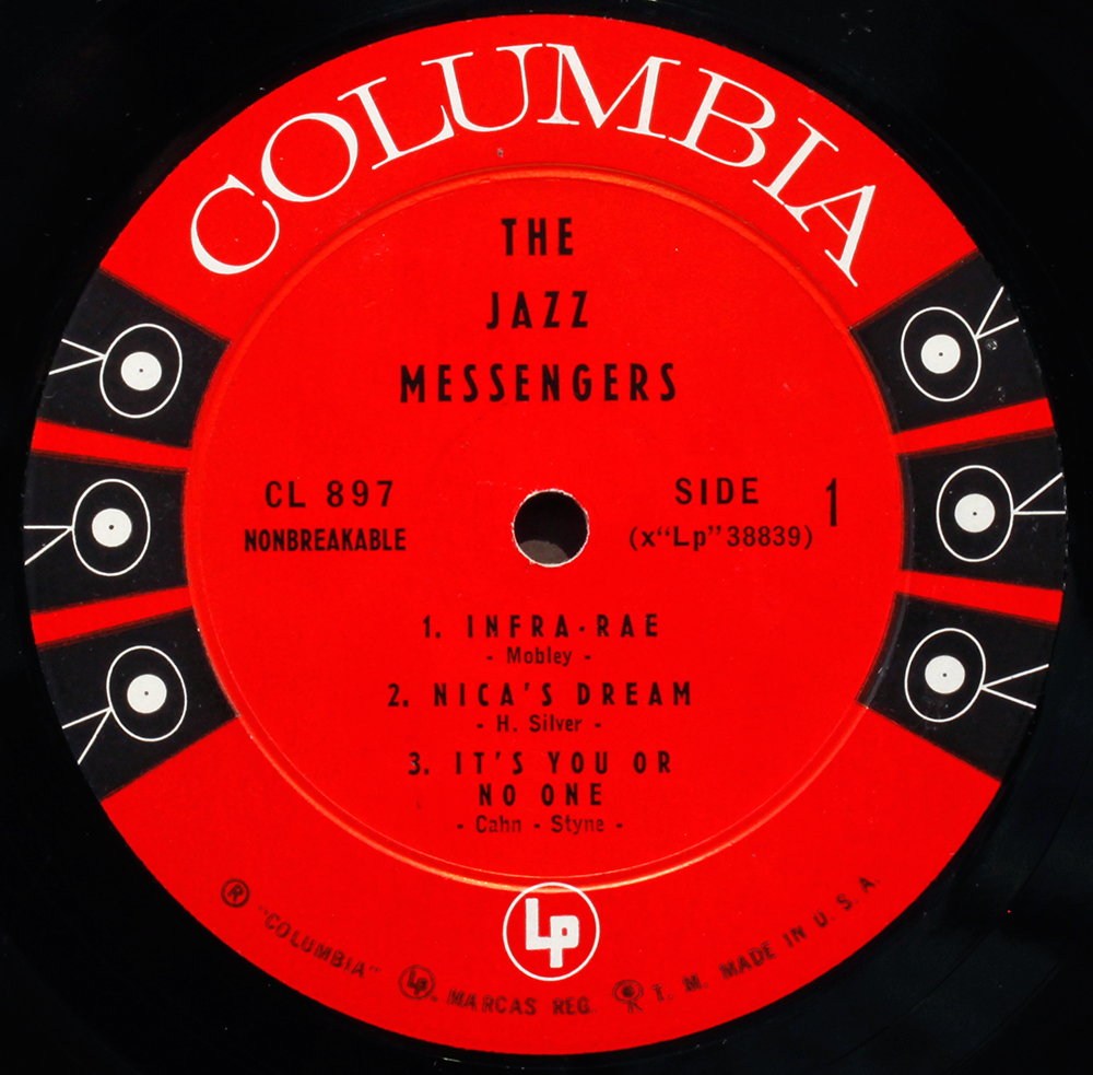
Hi LJC. I picked up three Canadian Columbia records recently including The Jazz Messengers CL 897 maroon and silver. I’m not finding much online about this release. It sounds very good to my ears. Have you come across these releases?
LikeLike
Hi.
CL 897:
I have a couple of Canadian pressings, indistinguishable from other US pressings. All the majors sent media to pressing plants on the two coasts and in the centre – Indiana/ Chicago – another copy probably went to Canada for pressing. Nobody wanted the freight costs of moving finished records if they could press locally. I have never understood whether they sent mothers, stampers or copy tape for re-mastering like they did with European distribution.
The issue with Canada is not whether they are any good, it’s the fact they are not “Made in USA” – collector’s premium says “not original” and marks them down.
LikeLike
I have an original big old 6 eye blue lable… guess it is only valuable because I love it and it was given to my step father who designed the backdrops for the theater production… guess Canada is ranked as being of no value.. they did great l.p. from master reels… I have a few master reels from LA and have no clue what they are worth either to others… to me they are my family history and I am the last of mine…
LikeLike
For those wondering . . . any and all Columbia pressings, in terms of deep groove, had these inner and outer dimensions:
– Inner: 2.6875″
– Outer: mostly 2.78125″, sometimes (in the early ’50’s) as much as 2.8125″; occasionally as little as 2.734375″
DG’s were used on at least one side of pressings from Terre Haute, IN as late as about 1968 or ’69, and from Pitman, NJ well into 1973.
1960-61 – when Pitman first opened – marked the first time we saw non-DG’s from Columbia LP’s. The pressing ring was usually set at 2.703125″, though I saw some with 2.6875″ or 2.7109375″.
As far as two-eye label variants, there were far more, for mono and stereo, than are shown here. The version seen on the copy of the Monk album (CS 9632) first appeared (with uncoated paper stock in warm red ink) in fall 1967, and switched to glossy paper (with Pantone 199 Red) at the very end of the year. The ‘® “Columbia”,’ and ‘Marcas Reg. Printed in U.S.A.’ as well as the “360 Sound’s” on that variant were all cribbed from the Columbia Masterworks label design. The walking eye at the bottom was a new addition. Anyone who’s seen mono LP pressings from 1967-68 will note that the ‘® “Columbia”, … ” rim print at bottom is positioned slightly differently from on the stereo label.
The “360 Sound” Mono two-eye on the Brubeck “Time In” LP was almost wholly cribbed from the Columbia Masterworks two-eye LP design, except for the positioning of the 360 Sounds and the rim print at bottom. That variant was used from early 1966 to about spring 1967.
The first two-eye design (on the later CL 1397 pressing, and also CS 8612), lasted from mid-1962 to about summer 1965. However, there were two variants of both “Guaranteed High Fidelity” (set here in Venus Medium, later replaced by mid-’63 with a smaller variant set in Copperplate Gothic Bold Condensed) and the “360 Sound” Stereo (first variant had no arrows, after mid-’63 the “360 Sound’s” were reduced in size and the arrows added on).
After the “Columbia Columbia” red/orange label was inaugurated c.June 1970, the two-eyes were consigned solely to deep-catalogue releases, with the last stereo labels used up by fall 1970 – and mono two-eyes continuing to be used well into the spring of 1972 (yes, 1972! – I have a pressing from that year of one of the 1956 issues of the Benny Goodman Carnegie Hall jazz concert, with the contours of the LP, plus the way one of the sides were cut that very much screams 1972, based on other mono LP’s I have from that year in my collection).
It should also be noted that there were typesetting differences on the label based on where pressed. The GL 503 (Black), CL 566 (red label/gold print), and CL 897 (six-eye mono DG) were all pressed in Bridgeport; CL 1397 (both six-eye mono CBS and two-eye GHF) were pressed in Pitman, NJ with Bridgeport typesetting, as was CL 2038 (two-eye WLP). CS 8575 (six-eye stereo CBS) and CS 8612 (two-eye black print 360 Sound Stereo) were both pressed in Terre Haute, IN, which (albeit with different fonts) also pressed the Columbia Special Products issue of JCL 1268. CL 2512 and CS 9632 were both Pitman pressings, or at the very least used Pitman type. As did PC 9451.
One factor on the sound quality of deep-catalogue issues deteriorating by the point of the “Columbia Columbia” label era, besides the use of umpteenth-generation tape dubs and multiple cuttings, was the change in cutting material, away from the Westrex 3A/B/C/D series of cutting heads (and Ortofon DSS 732), and replacing them with Neumann SX-68 cutterheads which, in the opinion of some, fit the newer rock music more than the “old stuff” like Brubeck’s “Time Out” or Miles’ “Kind of Blue.”
LikeLike
Your insight and depth of knowledge is always much appreciated.
LikeLike
WB, it is at this juncture we bow down and repeat “we are not worthy”.(Or as they say at the Complaints Department desk, “Thank you for bringing this to our attention”) More forensic stuff about fonts and printing, great! Thanks.
LikeLike
Re: “2.3 Columbia Six-Eye Stereo US (1956) DG”
Not being an expert on Columia labels, I would like to know whether the six-eye STEREO label really dates back to1956. In my estimation, one of the first stereo DG six-eyes must have been CS 8072, Duke Ellington’s “Newport 1958” (in fact, studio recordings overdubbed with crowd noise and announcements from Newport) which was never released on CD, except for a mono version by Mosaic Records. In my knowledge, Columbia did not produce/issue any stereo LPs before 1959.
LikeLike
No stereo in 1956, of course, quite right, bottom of the class LJC. The Six Eye logo ran from 1956 through to 1962, however there would not have been a stereo variation until such time as stereo was produced. I believe Columbia’s first commercial stereo release was in 1958 – Ray Conniff’s ‘S Awful Nice CS 8001, though I can’t say I have seen it personally. No doubt there were Columbia classical series Masterworks and Original cast/Soundtrack series in Stereo around then too. Let’s settle on 1958.
LikeLike
Oh yes… I forgot about those Ray Conniff records. “Broadway In Rhythm” must have appeared in the same year. And I forgot to mention: There was, of course, one CD re-issue of the Ellington LP. It was French, and it didn’t have the original cover art. I acquired the original stereo six-eye a short time ago, which runs for an unusual 30 minutes each side. Quite a technical achievement in those days, probably resulting in some loss on dynamics. Still sounds pretty good.
LikeLike
Whilst the stereo “six-eye” label debuted along with the stereo disc itself in 1958, the original, mono “six-eye” was actually first introduced in 1955. I’ve seen very first-pressings from that year (including 10″ LP’s) where the record shape was same as 78’s (before they sunk the playing area and raised the outer edge and label area).
As for the 1961-62 six-eye “CBS’s,” most mono six-eyes had the “CBS” set in Futura Medium, as opposed to Venus Medium as seen on the mono example 3.1; that latter font I have seen on virtually all stereo 1961-62 six-eyes as on 3.2.
LikeLike
It looks exactly like your photo of the label of the period, just with a deep groove. I can link you to a high res (ish) photo if you want to include it here on your blog.
Again, this blog has been tremendously helpful to me in identifying both releases that I have and sniffing out later reissues in my purchasing. Thanks so much for keeping this blog alive and well.
LikeLike
Just tidied up the duplicate post, singelsklubben, all part of the service.
If its just a deep groove with no other material differences in the label, its not worth worrying about, I’ll just tweak the text – though thanks for the offer. Appreciated.
LikeLike
Excellent!
LikeLike
I’ve found a ’61-’62 Mono six eye CBS that DOES HAVE a deep groove. Albeit on a Marty Robbins record.
LikeLike
Unusual but not impossible – the deep groove pressing die was still around though on its way out. Could be a contract pressing, who knows. – what is the Matrix look like? Classic “Columbian” ?
LikeLike
I have a Mono six eye CBS also with deep groove. Duke Ellington – Blues in Orbit. Matrix / Runout (Side 1 stamped): XLP49301 2C
Matrix / Runout (Side 2 stamped): XLP49300 1D
LikeLike