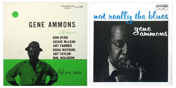
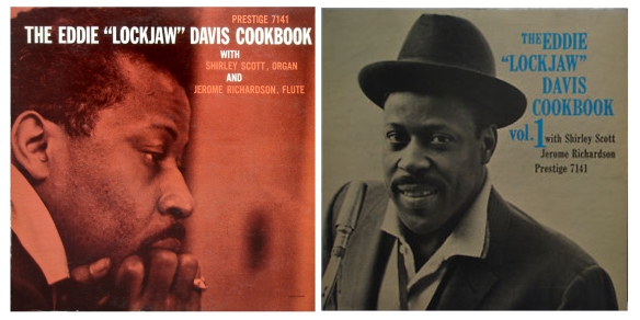
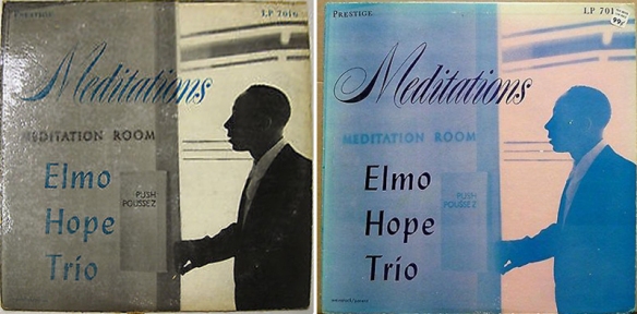
First and second covers for original Prestige releases, pictures from the bounty of the internet, as I have few if any of these myself. Though some alternative covers were introduced to accompany the formal reissue with new Prestige catalogue number, the focus here is where two or more covers exist for the original Prestige release.
My Thanks to Rudolf, for his encyclopaedic knowledge of all things jazz, and the good Dottorjazz for same. I’m sure there may be other alternatives, and a few I have missed as I can’t source a picture at the present time, and some I may have mixed up the first with the second cover, if you know better, feel free to add to the comments.

 1st cover Prestige lp in italic lower-case font, 2nd cover, capitalised PRESTIGE HI FI; 3rd issue cover is blue instead of green
Added November 27, 2019: Prestige 7158, Cattin’ with Coltrane & Quinichette
– hattip Aaron

Updated continuously as new information comes to light


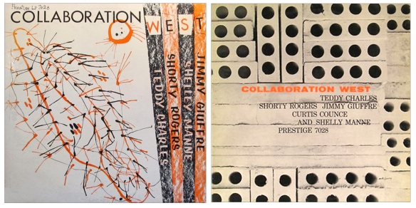




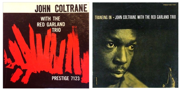






Coltrane 7105, red cover, can be considered an original having all the correct features, or a reissue? I’ve got the greenish. Rudolf?
LikeLike
I believe, without guarantee, that the greenish NYC pressing is the first original. The red variant came later. Mine is a 1958 N.J. pressing, without adress on the rear. An obvious second issue before they reverted to the greenish N.J. issues, always with yelow/black labels.Up to here all sleeves laminated. Thereafter unlaminated sleeves and the monstrous blue trident label, being the third issue.
It seems that red cover NYC versions exist. They are to be positioned just before the 1958 N.J. red issue. I would consider them to be as original as a greenish NYC issue, even if the latter is the version which was first issued.
LikeLike
as Rudolf has stated today on Jazz Collector, 7142, the first Bergenfield, has two variants: photo credits on front in black, later (but rarer) in white; greenish/turquoise tint, later bluish. I rushed to look at mine: greenish and black, I will sleep well tonight. great Rudolf, you know ’em all.
LikeLike
a bit more, not so collectible, but anyway
7154, 7172, 7205, 7228, 7257, 7260, 7267
LikeLike
I’ve noticed variations in the cover art of the Herbie Hancock album “Empyrean Isles”. I always thought the cover photo had a green overlay, but my copy (an early ’70s reissue) is more blue. Any insight?
LikeLike
A screen grab of Google image search for Empyrean Isles covers:
Illustrates how hundreds of pictures taken in differing light changes the colours on screen. I imagine much the same happens when printers don’t use the identical Pantone-reference inks when reprinting a cover. I guess any shift in colour is “accidental” rather than a conscious effort to print a different colour.
LikeLike
question for Prestige wizards: 7132, Gene Ammons The Big Sound.
both NYC and Bergenfield have the same front orange cover.
I found three different backs with some variations on the lower part of back cover:
1: NO writing under boxed advertising for other issues; NO address
2: lower left, under box: Users of wide-range equipment should adjust their controls to the RIAA curve for best results; NO address
3: same in lower left AND, lower right: For free catalogue send to PRESTIGE RECORDS, INC., 447 west 50th street, New York 19, n.y.
which is the first cover?
LikeLike
the third.
LikeLike
thanks again Rudolf, I bet you had the answer.
being an emmerdeur I’ve another question I’m posting right now, on Columbia.
LikeLike
vive les emmerdeurs!
LikeLike
on the top of my head, the seconds (or thirds) are:
7005, 7008, 7009, 7012, 7013, 7014 (3 x), 7015, 7016, 7020, 7021, 7028, 7029, 7033, 7038, 7039 (3x); 7043 (3x), 7050, 7053, 7060, 7064, 7083, 7118, 7123, 7130, 7168.
There are more in the funky genre, Willis Jackson, E.L. Davis, Gene Ammons, Shirley Scott, but they are of less interest.
LikeLike
Some progress, I guess half way there. just one or two I can’t source a picture anywhere. A lot of surprises, it is indeed an education. Who would have thought – Informal Jazz becomes Two Tenors. You can sense Prestige realigning which artists have made headway since the original release, how it can be repackaged, squeeze more sales out of the back catalogue. Fascinating.
LikeLike
7043 is an example in kind: Elmo Hope being less fashionable than Hank and Trane, the first re-packaging became Two Tenors – Hank Mobley and John Coltrane. The second re-packaging was an outright Coltrane album with Hank Mobley sideman.
In the liners no reference anymore of the original role of Elmo.
LikeLike
See extra photos and a lot of neat close ups on the Monk 7053 in the gallery that I made of my own copy by clicking HERE. Make sure to view in slide show mode for a full screen, hi-def, experience 😉
LikeLike
Good start. Neat project. Thanks, as always.
I’m sure Rudolf knows the answers to all these, but here is my vague recollections, whatever they are worth (beyond Dottore’s list). I think 7008 and 7009, the Wardell Gray Memorials, were later released with the playground cover (same as the Clifford Brown memorial). 7020 had different colors. 7039 as well.
LikeLike
7014 and 7029 should be presented the other way around. There are many more! 7043 exists in three different versions. Yours is a good start, esp. considering that you had to source elsewhere.
LikeLike
Transpositions fixed. The long list… may take little longer, and depend on the weather.
LikeLike